BBE Handelsberatung und IPH Handelsimmobilien
Corporate Design
Distinctly together
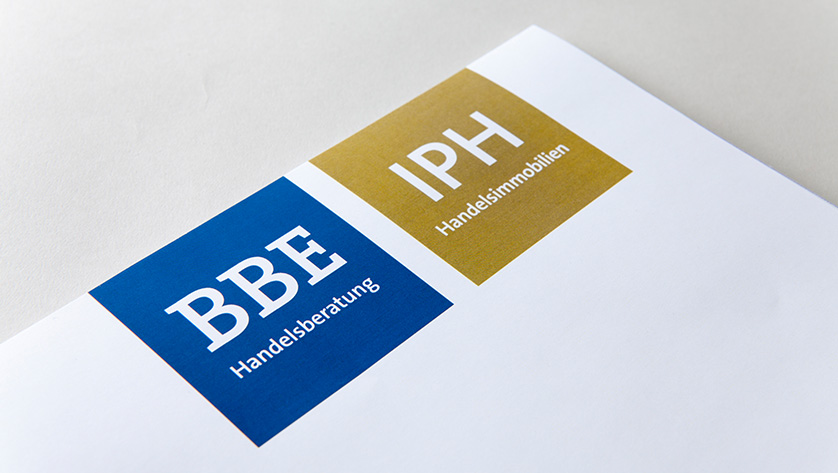
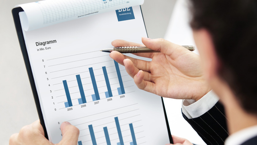
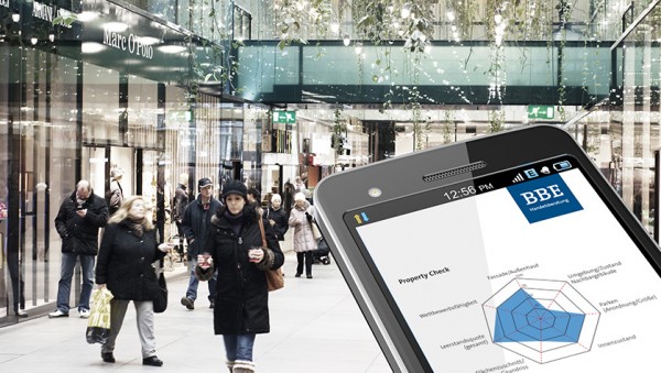
BBE Handelsberatung and IPH Handelsimmobilien are two brands with business activities in the same market segment. While BBE Handelsberatung has positioned itself as a commercial consulting specialist, IPH Handelsimmobilien is the specialist in commercial property – offering everything from first concept to lease or sale to centre management. Since both brands act independently but also as partner in joint projects, they needed a unique corporate design development conveying this balance of recognisable partnership and necessary distinction.

The idea
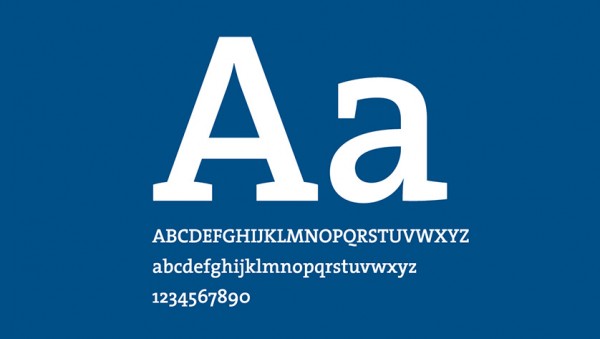
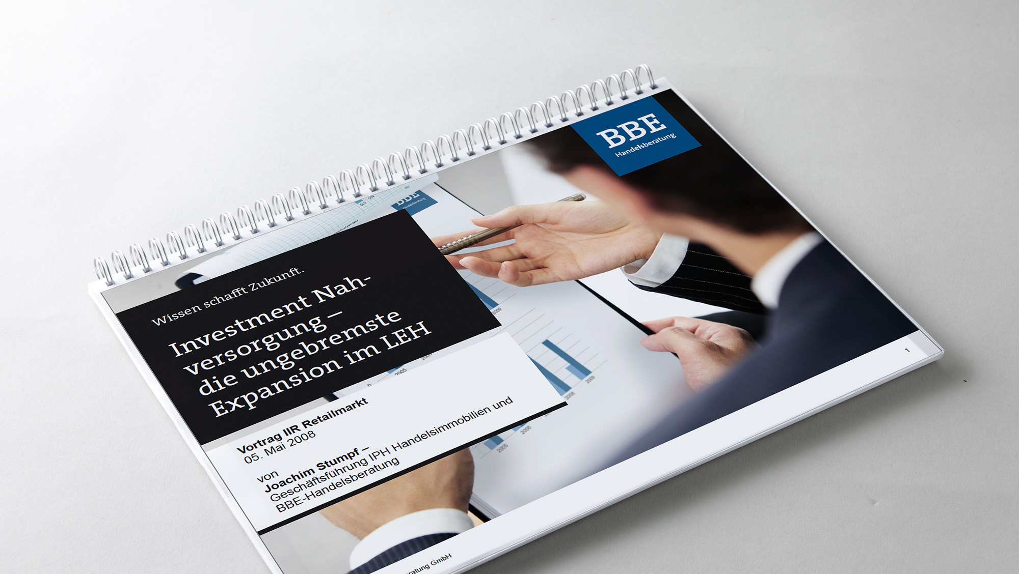
The corporate font says a lot about the character of a brand. It creates a striking, unique presence and conveys clarity and emotions. It needs to be flexible and versatile, while always making a lasting impression. An impression of high quality. During corporate design development, we look for a font that has a common “core” fitting the position, while also creating the best possible visual code for the two fields of trade consulting and property management. On the one hand, we need a font with a somewhat scientific and intellectual feel and a clear, straightforward “hands-on” impression on the other. The solution is a font available as a serif and sans-serif family: The perfect blend of rational competence, technical emotionality and intellectual effect: The Serif. As primary corporate font, The Serif highlights the brand’s professional but also lasting effect. It is clearly legible, self-contained and practical. Its visual effect supports such values as competence, trustworthiness and seriousness. The serif design supports the message of competent consulting services. It is the perfect blend of rational competence, clear emotionality and factual effect: The Sans. As primary corporate font, The Sans highlights the brand’s professional but also lasting effect. It is clearly legible, self-contained and practical. its visual effect supports such values as professional conduct, methodical approach and “hands-on”. The sans-serif design is the perfect support for the management aspect. The two specific brand colours blue and gold are added for more distinct design options.

The result
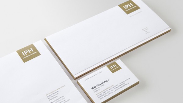
Two strong, independent designs for BBE Handelsberatung and IPH Handelsimmobilien – with clear similarities in their design elements, but also with a clear distinction created with the typography and specific brand colours. Both brands can act independently and as recognisable partners in joint projects.
LEARN MORE?
Contact
Veronique Bielecke
Senior Account Manager
Tel. +49 89 895622-34
veronique.bielecke@red-agentur.de