Real I.S. AG
Sales brochure
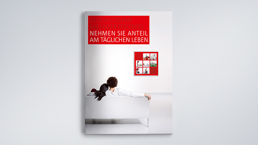
Adding emotion to a sober fund
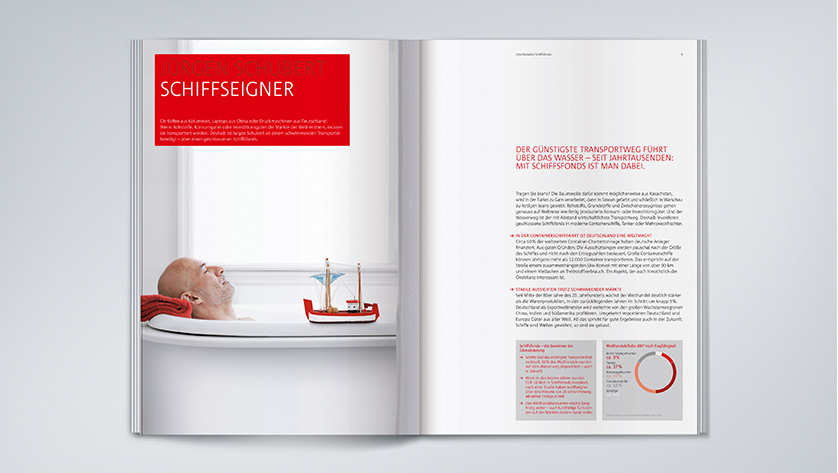
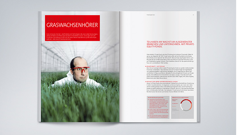
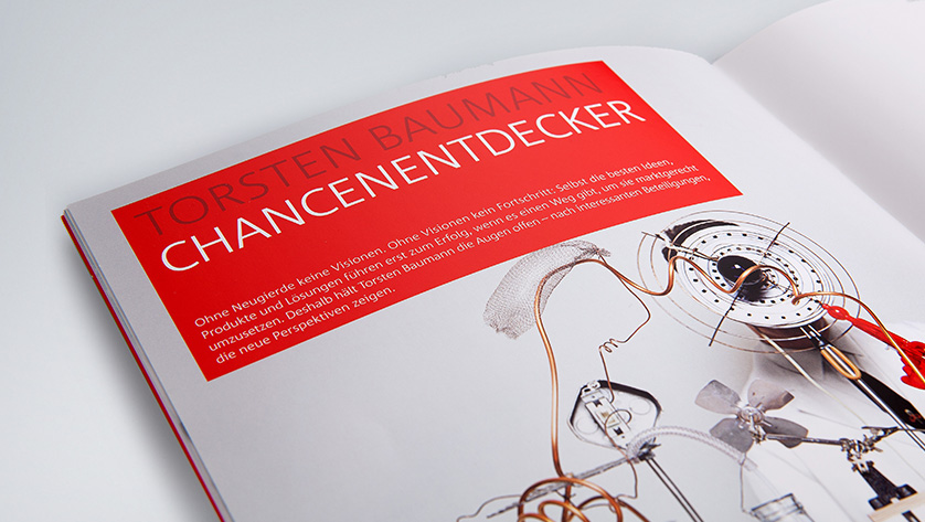
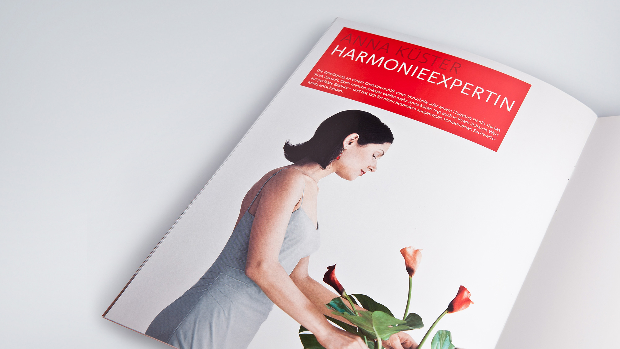
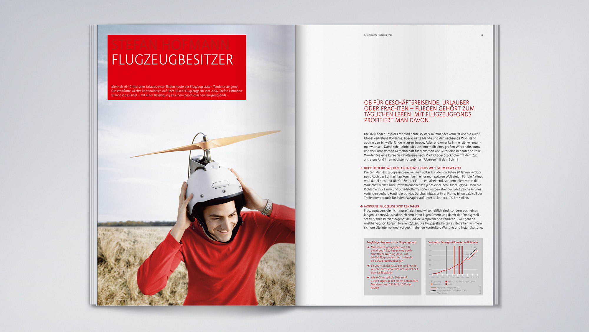
We have designed a sales brochure for the Sparkasse Group which shows the independence and security of closed-end property funds in a credible and emotionally appealing manner. We have illustrated the funds’ individual industry and subject areas with appealing and unusual testimonials which underscore the funds’ individual character. Customers thus become a “real estate tycoon”, a “ship owner”, “someone who can hear the grass grow”, an “aircraft owner” or an “energy provider”. The large-format portraits add interest and make it easier for the reader to find their way into the individual chapters.
The idea
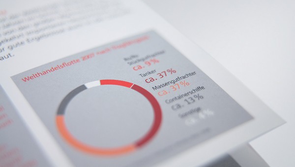
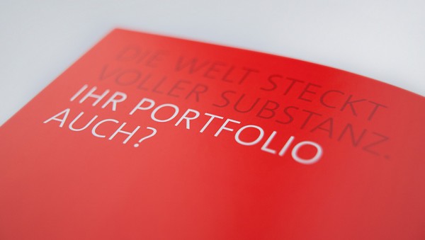
The Sparkasse Group’s corporate colours – red and grey – can be found in the interim headlines, quotes, tables, graphics and information boxes in the layout. The layout is clear and straightforward with its large amount of white. Consistent use of the format-filling images on the left side of the brochure and the text on the right-hand page calms the brochure’s visuals and underscores its informative character. We have integrated the red text box from the Sparkasse corporate design as a headline box. It is a linking element on all of the double pages, and ensures the typical look and feel of the Sparkasse. Depending on requirements, square information boxes with a grey background can be integrated into the double-column text matrix, providing graphs, tables and additional information.
LEARN MORE?
Contact
Stephanie Prem
Senior Account Manager
Tel. +49 89 895622-38
stephanie.prem@red-agentur.de