Haufe
Corporate logo umantis
Communication follows strategy
For their positioning and communication as a solutions provider in the area of talent management (with the product umantis Talent Management), Haufe needs a high-profile word logo. The word logo must be usable across all channels, although the focus will be on the online channel.
More projects of Haufe Verlagsprogramm Haufe Suite campaign umantis campaign Kundenmailing Packaging Systems Logoentwicklung wowinex Design book programme
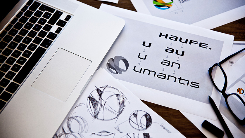



The idea
A “normal” image of software packaging does not do justice to the size and complexity of the solution, and a purely abstract image (without focus on the name of the solution) is not understood quickly enough. We decided to go with a modular word logo concept. In keeping with a liquid brand, we inferred three sub-logos for three performance modules from the figurative brand. The word logo “umantis” is set in the lean font of the Haufe logotype.
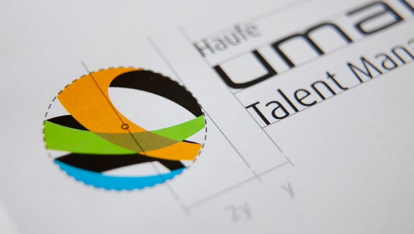

The result
The brand core “Companies need success. Success needs energy” is represented by the image of a three-dimensional sphere that develops out of three bands of different colours. Dynamic due to its outer and inner shape, multi-layered due to the three module colours, and concise due to the black shadows. The individual sub-logos of the performance modules, umantis – Winning, umantis – Developing, umantis – Performing, each have their own module colour. Since the Haufe group has integrated the Swiss company “umantis” with the mono-brand “umantis” into their product portfolio, Haufe appears as a smaller corporate brand above the name umantis.


LEARN MORE?
Contact
Susanne Gößler
Senior Account Manager
Tel. +49 89 895622-18
susanne.goessler@red-agentur.de
