Münchener Hypothekenbank
Corporate Design
Clarity, precision and transparency
Münchener Hypothekenbank is a specialist in financing national and international residential and commercial property and currently ranks among the few independent mortgage banks in Germany. We have optimised the corporate design manual for MünchnerHyp and have developed an end-to-end master template in PowerPoint for the company.
The idea
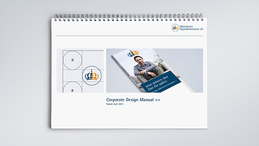
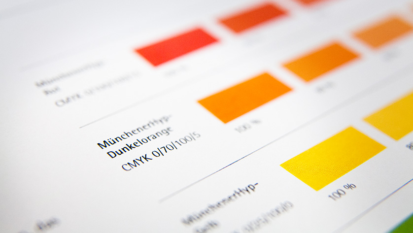
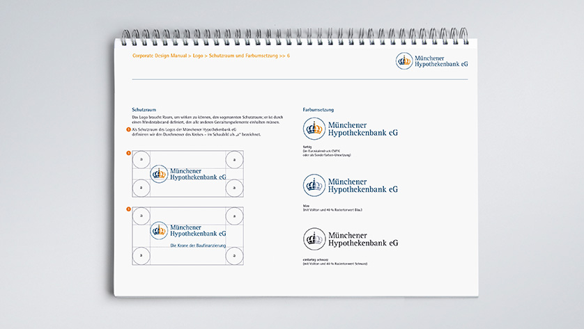
The corporate design manual guides users using design examples and sample publications, taking them through MünchnerHyp’s brand identity in a logical, easy-to-understand way. We have kept the tried-and-trusted font mix of Rotis Semi Sans/Semi Serif and Times New Roman. A key sub-point are the corporate colours: the exact transition of the the CMYK colours into printed RGB colours for screen use.


The result
We broke down and structured the company’s PowerPoint very clearly and in a user-friendly manner according to the content-based and corporate requirements of a mortgage bank. This ensures a uniform appearance for presentations for all of the bank’s branches in Germany and abroad. We also attached particular value to developing graphics and tables. Clarity, precision and transparency are the design factors for optimal presentation of the company’s figures and results. The starting page is in corporate blue, chapter separators with sub-titles – in both a full-page dark blue version and an alternative version with a full-page visual. As a result, these pages create a clear turning point in the presentation. For IT reasons, Arial and Times New Roman are used as fonts in PowerPoint. These fonts are available on all systems.


Mehr erfahren?
Ansprechpartner
Stephanie Prem
Senior Account Manager
Tel. +49 89 895622-38
stephanie.prem@red-agentur.de