Haufe
Logo development
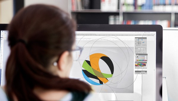
Word mark and logo design
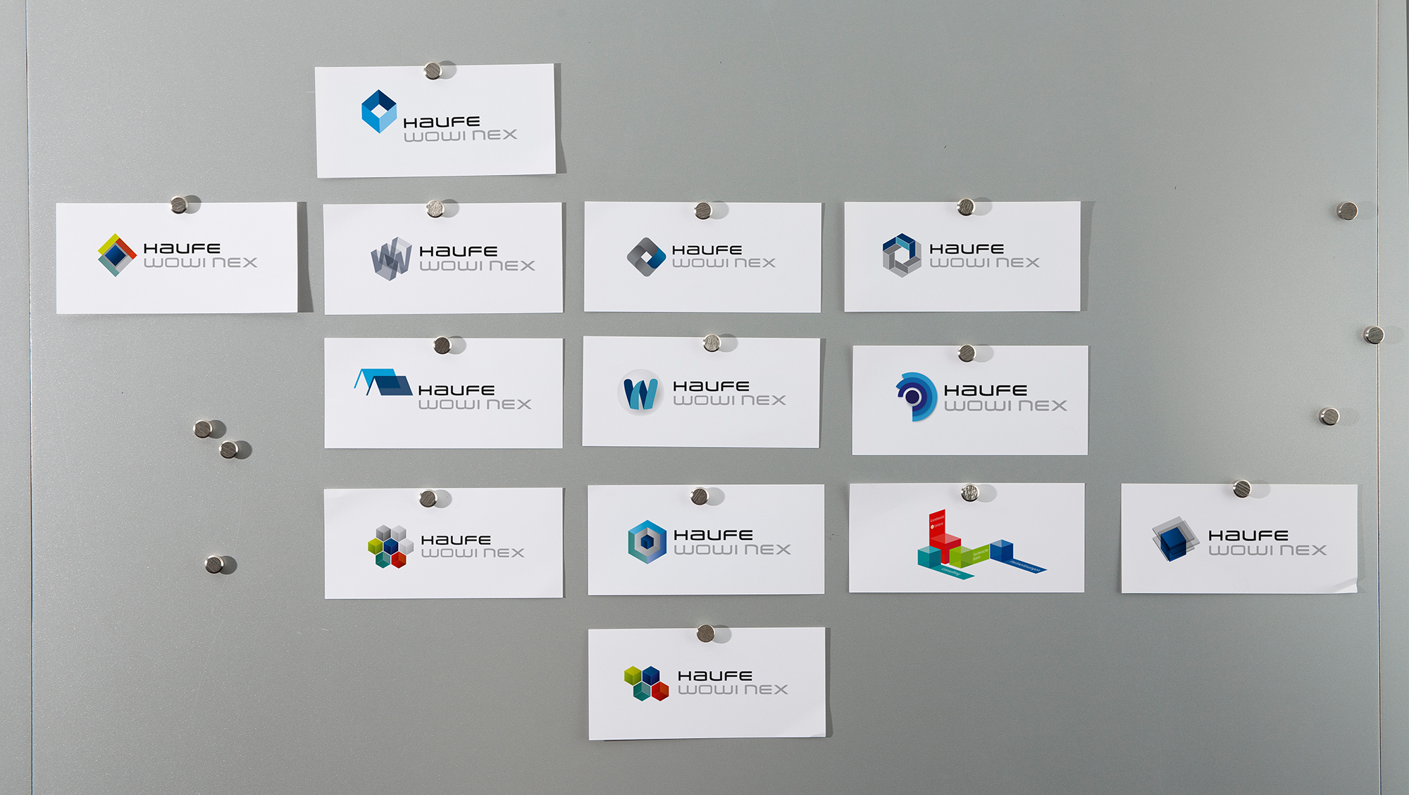
As part of a software relaunch, Haufe asked us to develop a new word logo for their software product for housing and real estate management: Haufe wowinex. The design of the new brand was to reflect aspects such as the modular building block system of the software, as well as its performance range and the idea that the software can be specifically tailored to the customer (software as a service).


The idea
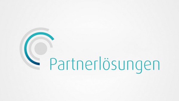
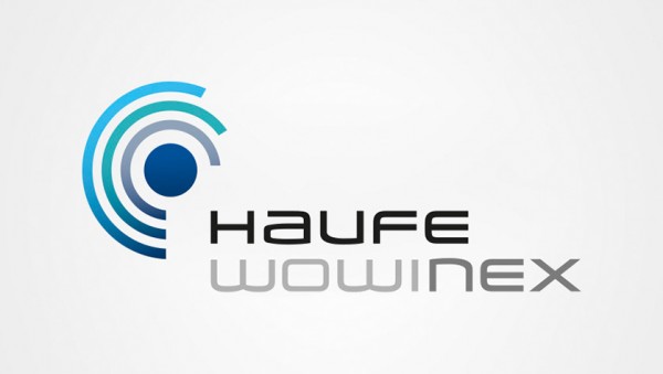
We visualised the modular performance range of the software product using three concentric performance rings surrounding the symbolic core of the product, a blue dot. The blue dot derives from the Haufe corporate colour. It stands for the basic module and the content. The additional three shades of blue of the performance rings were generated from the Haufe blue. They stand for the additional module, partner solutions, and the consulting module. The dynamic and flexible configuration of the software is illustrated by the different radii and lengths of the performance rings.
The result
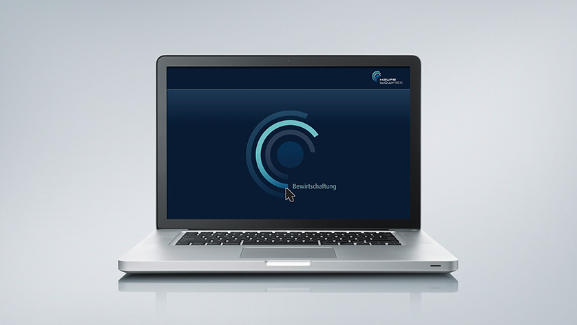
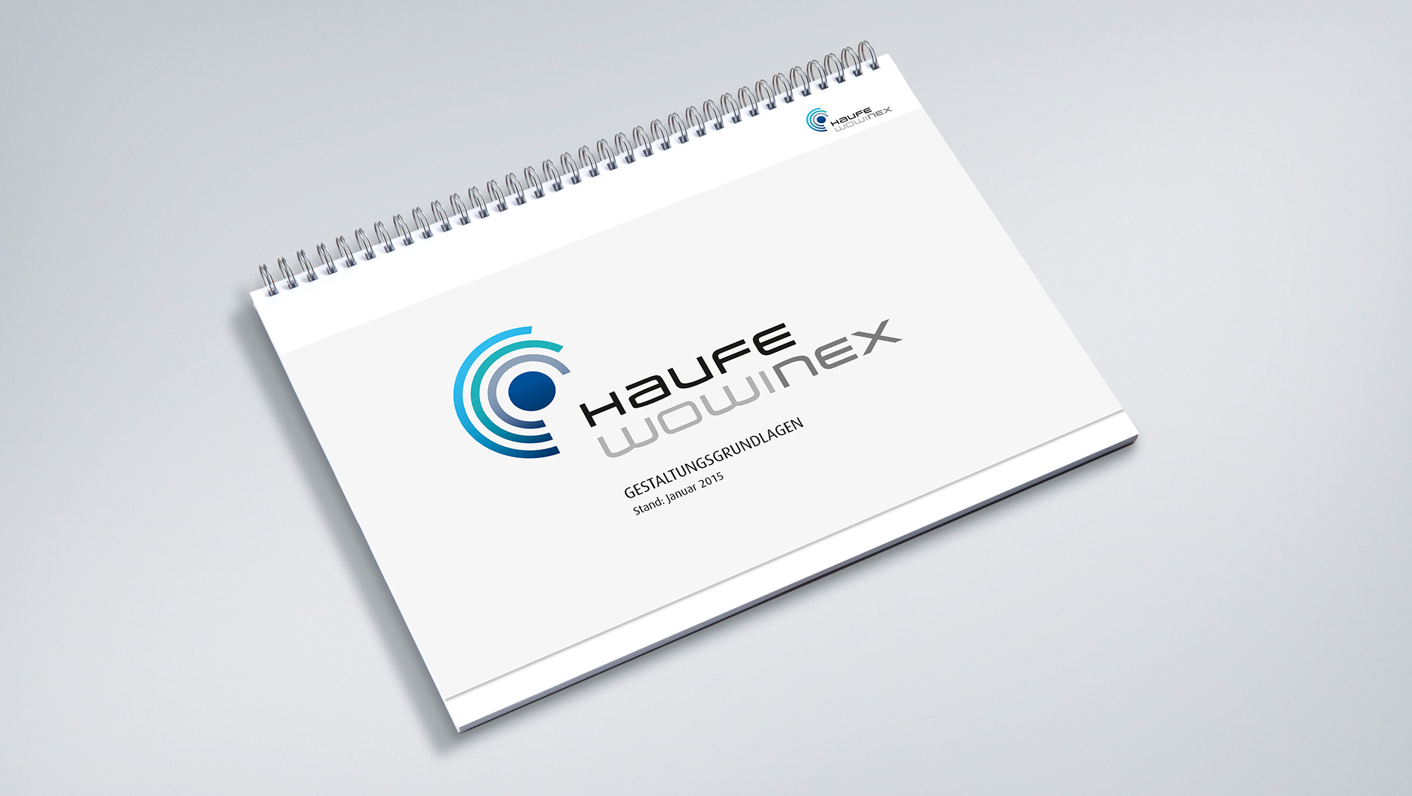
We have created a complete, circular logo that visually summarises the product features with its range of blue shades and the different linear circular segments. In order to integrate this logo into Haufe’s existing brand architecture, we place the product and corporate brand at the same level so they form an equitable unit. This is also reflected typographically by the use of the same font. The logo is designed to be minimised, so it can be displayed on the desktop screen as a program icon. We defined the colour range from the Haufe corporate colours and recorded all design requirements in corresponding guidelines.
LEARN MORE?
Contact
Susanne Gößler
Senior Account Manager
Tel. +49 89 895622-18
susanne.goessler@red-agentur.de